
Akademi for Programmering, Oslo
The purpose of the redesign is improving UX using the quantitative and qualitative data we gathered in the year before.
See websiteIntroduction
Iteraring on the first design
Since we had a page that was already live and working, I first looked at the data we gathered in the past year. This data included CTR numbers that showed us what USPs, images and texts worked the best in advertisements.
I also went through all the contact e-mails we got to figure out what people ask frequently. This gave me a good insight into what people think is important information, but don’t understand or can’t find on the webpage. I made these more obvious on the new front page.
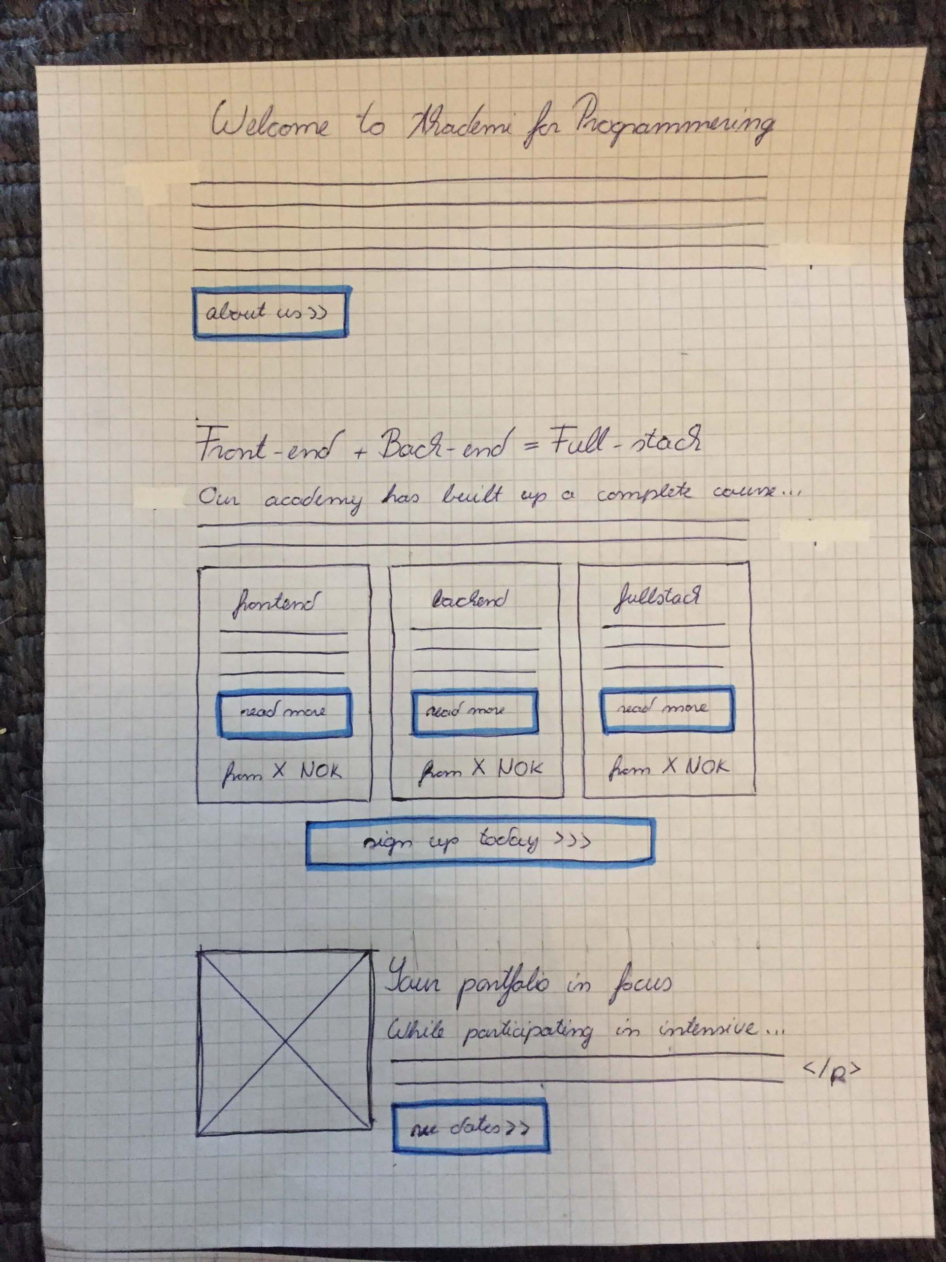
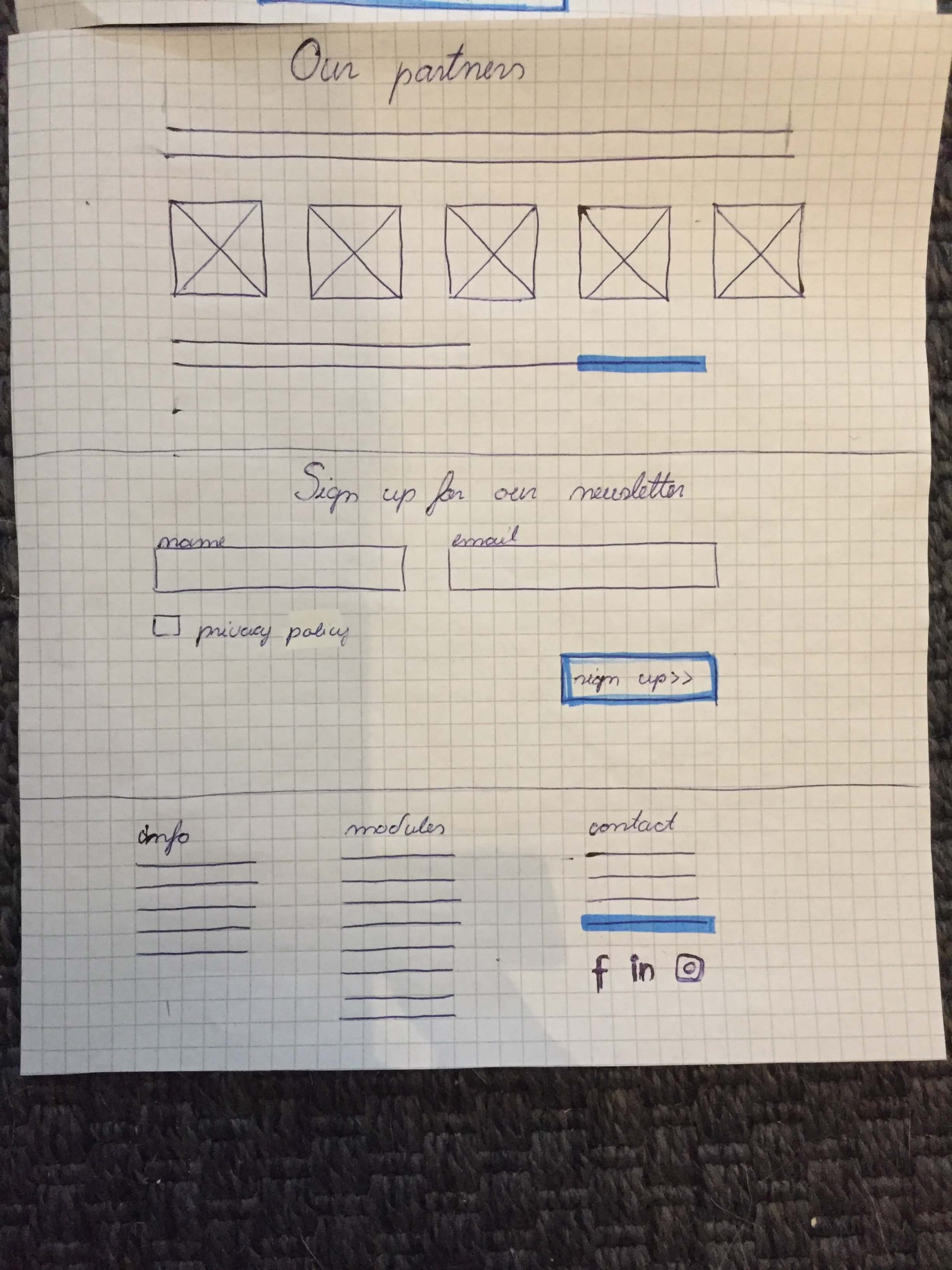
Once I had the data I needed, I made sketches to arrange the new content, that later developed into wireframes and a prototype.
I also created personas to doublecheck and reinforce the importance of our USPs (please, contact me for personas).
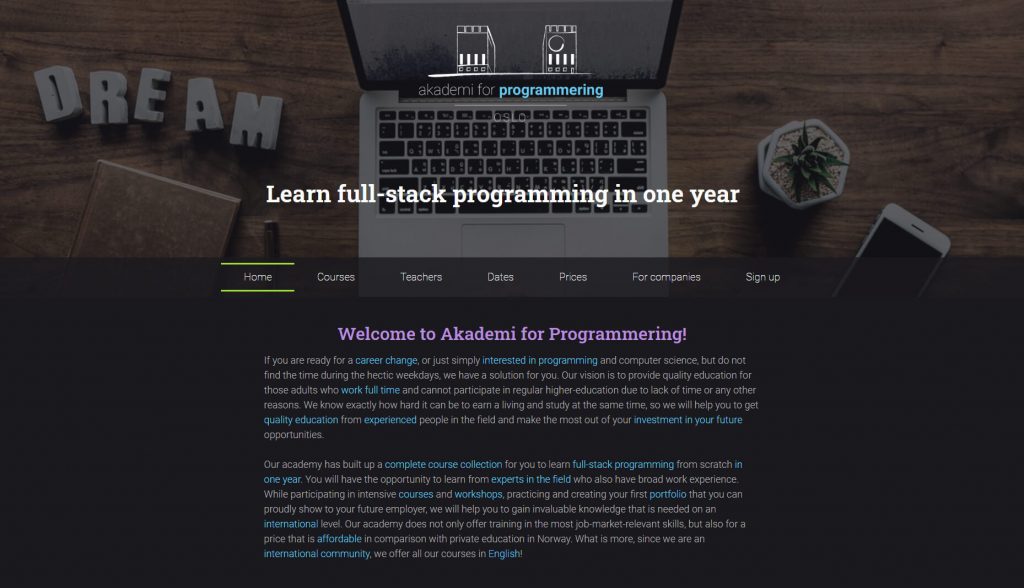
A remark about the difference in the prototype design and the finished product: we decided to use a light theme due to different usability concerns as well as better compatibility with recognizable partner logos.


Data
Quantitative data from advertisements
The most effective texts and headlines were the ones that included the location, practical workshops and portfolio. The most effective headline even brought 85% of the clicks.
The most effective CTA was “Learn more” – so all the buttons have “Learn more” on them now
Qualitative data from people
The most common things people asked about:
- when and where the courses are
- if previous experience is required
- general confusion if it’s an online course, or an evening course
Design changes
Imagery
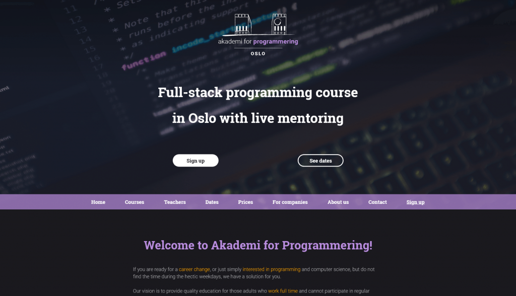
According to our data, images with code speak to our target audience, therefore we choose a banner where code is visible, but it's homogeneous enough to be the background for our hero text.
Our old slogan was “Learn full-stack programming from scratch in one year by experts”.
Many asked if they could take the front-end and back-end courses separately, due to time and money problems. We concluded that 1 year is too big of a commitment, so we reduced the course’s price, and its length to 6 months, and made the two parts available separately.
Competitor analysis also revealed that live mentoring is our strongest unique selling point (USP) compared to online tutorial sites like, Freecodecamp, Udemy or Udacity. Therefore it is also included in the new slogan.
Our new slogan is “Full-stack programming course in Oslo with live mentoring”.
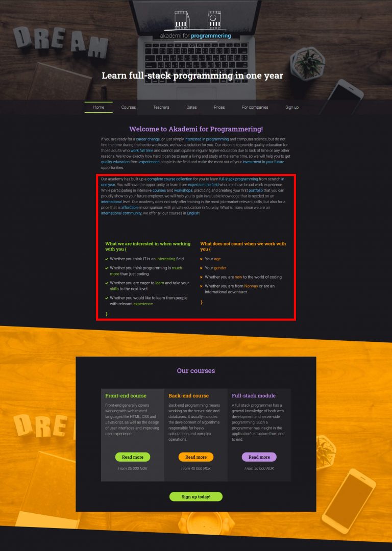
Original
Redesign
Getting to the point
I moved parts of the intro section to an “About us” page in order to display the courses withing fewer scrolls. I did this because I assume people are initially more interested in what solution we have for their problems, rather than who we are.
I also changed the button text from “Read more” to “Learn more”, because that’s what performed best in the advertisements.
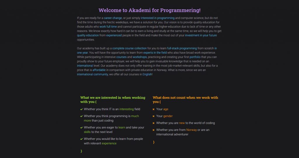
Original
Redesign

Emphasized USPs & readability
In order to improve readability I divided the text into smaller bits, and added headings that included our well-performing USPs and things e-mails frequently asked about.
These keywords are:
- portfolio
- weekend courses
- in Oslo
- for beginners
People kept mistaking the blue words for links, so we used orange for highlighting instead.
Original
Redesign

Other interesting results
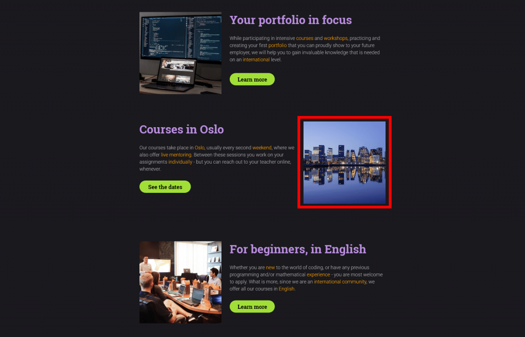
Initially I chose a quite artistic picture of Oslo to represent the location, but testers said that there was a high chance users are not be familiar with this view at all.
Therefore I chose a more casual image, something visitors and Oslo-ers would see every day: the Rådhus It is represented in our logo, and it makes users recognize the place before they read anything.
Original
Redesign
